
My first step was to scour dafont.com
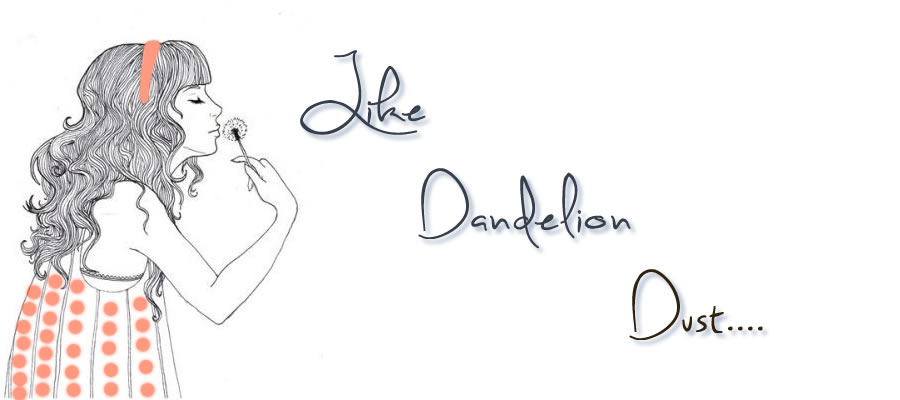
The font I chose is called "Sweetly Broken." The first image editing technique I used was to drop the shadow on the text. I then dropped the opacity to 65% and increased the softness to 4. I also put the distance at 7 so it wouldn't be too close or too far from the text. I chose an unsaturated, tinted blue to give a subtle shadow that referenced the blue background. I also added some orange to the girl's dress to pull out the compliment.
No comments:
Post a Comment