Thursday, January 26, 2012

Other Website Headers

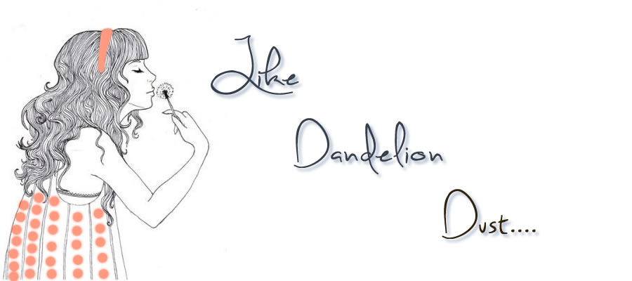
The first header I found was on http://www.cult-f.net/
It's a perfect header for this website. It has a very ethereal, dreamlike feel that doesn't detract from the posts in this site. The site discusses blog design and offers tips and links to help you improve your site. Although most sites on web design tend to be more rigid and business like, I really like how the header emphasizes their theme of dreaming up unique ideas for your site.

The second website I found was http://www.visitcascadia.com/
The website advertises a fun family vacation in Cascadia and the header emphasizes the fun. It's a happy bright color that blends with the rest of the page well. It also includes images of relevant locations you can visit on your trip. I especially like how the text and links blend well into the header and the entire header bleeds into the main page smoothly. It kind of reminds of the giant mural on most Trader Joe grocery stores.

This last website I found was really pretty http://www.freepeople.com/
I like how soft and feminine the header is. It goes well with the title emphasizing freedom. The only thing I might have changed was to increase the size of the title. It almost blends in a bit too much. However, if they truly want to emphasize the clothes then pulling the title back definitely achieves that . I especially like the colors in the header. It is very desaturated and is consistent throughout the site. That pink and gray is used in the middle section as well.

New Header

So, for my new header I decided to go a little bigger and more fun and inviting. The darker colors were getting a little depressing.


 My first step was to scour dafont.com
The font I chose is called "Sweetly Broken." The first image editing technique I used was to drop the shadow on the text. I then dropped the opacity to 65% and increased the softness to 4. I also put the distance at 7 so it wouldn't be too close or too far from the text.  I chose an unsaturated, tinted blue to give a subtle shadow that referenced the blue background. I also added some orange to the girl's dress to pull out the compliment.


Friday, January 20, 2012

Website Images

This image portfolio website
has several amazing photographs optimized as JPEGS. It is the best option for this site because they are displaying photographs. If you are going to be selling or even displaying others' work you want it to be the best quality and JPEG allows that. I was very impressed with all of the images I saw and loved that you can find just about any type of photo from travel to pictures of dogs.


So with all of this SOPA stuff going on I thought it was interesting that I found that
uses a PNG image for their logo. Wikipedia is a cool site that I know just about everybody uses these days. I like their logo because it really stands out on the page. The red dot in the middle clearly brings your attention to it and optimizing it as a PNG doesn't seem to affect the colors. It is a perfect type of file to save it as because it is a simple clip art logo.

It was really hard finding a site that used GIF images. It seems like very few people use anything but JPEGS because the quality is better most of the time. This is the only site I could find with a GIF image that wasn't blurry and cheap looking.
It's a simple image that works well with the site but you can tell that the site as a whole was created by someone with little experience who just wanted a cute picture of dogs, which was relevant to the business. I mean all the pictures are cute but they are basic and you can get away with using a GIF format as they are not high quality photographs.

My Images

This first image was a lot of fun to make. My friend took it at a camping trip we took for my husband's 24th birthday. When I cropped the photo I used the generic cropping tool rather than the pen cropping tool. The reason I did this was that I wanted nice clean lines. I have done a lot of scrap booking with my mom and I wanted this photo to have that feel. I decided to optimize it as a GIF image because of the monochromatic color scheme. GIF images only utilize a small number of colors, and is best for pictures with mainly solid colors. This image has large areas of solid color in the foreground and the background was meant to be a bit blurred already and the GIF optimization did not change the look much from the original.


This is a picture I took on a typical morning in my house. I chose to edit work with this picture because it has a distinct orange tone to it because of the cats' fur and the laminate flooring. Because the original had so much extra space around the cats I used the pen tool to cut out exactly what I didn't want and then used the inverse cropping tool to make cleaner lines. I know I could have done it in one step but I wanted to practice with other tools. I decided to save this image as a JPEG because of the wide variety of colors in the image. JPEG is best used to optimize photographs with lots of texture and colors and this image had both.


This is one of my favorite pictures of my youngest dog Riley. My photographer friend took this picture on Thanksgiving and edited the image beautifully. I cropped the image with the inverse cropping tool so the image was focused on her expressive eyes. I decided to leave optimize this image as a PNG file because it was a simple black and white image and had a lower file size than either the JPEG or the GIF and I could reduce the amount of colors used without damaging the image quality.

Saturday, January 14, 2012

Color 2: Blogs and Templates

Monochromatic
http://newswordy.com/words/archive/
This is a very odd site. it is literally a bunch of random words in black against a gray background. Once you click on each word it is just black writing against a random solid color on the whole page. Interesting but I would never do this it's just so out there.

Analogous Color Scheme
I had a difficult time finding a good analogous scheme that I liked. I ended up choosing a super cute template called Girls Life. It uses blues, purple, and red/pink. It's very childish but fun and would be great for say a 13 year old girl's first blog. It just made me smile because it reminded me of the drawings  on the American Girl books I used to read all the time. Not the doll stories but the other ones like the Quiz Book, Sleepover Book, and others (oh you have to know what I'm talking about fellow ladies.......I hope)

Complementary Color Scheme
This was actually my favorite template I found: Aquatix. I like the use of yellow and blue in a fresh and upbeat manner. It's not over the top obnoxious which is nice. It's just very cool and relaxing. It also complements the colors of the fish that appear in the graphic near the top of the page. I would use this for like a small aquarium advertisement or something else relating to fish (just not a restaurant that's a little depressing).

Saturated Color Scheme
Oh my gosh this is the most obnoxious color scheme but it's as saturated as you can get. YIKES!  I mean it's pretty when you first look at it but I mean there is no way I could read that for more than five minutes or so. It's called Moradito. Yes you can make it easier to read with a white post background but the colors are just so distracting it's really hard to read.

Unsaturated Color Scheme
Ok, much better this isn't burning my eyes out of my head when I try to read it. This site, in my mind, is the very definition of unsaturated colors. This site is composed completely of grayscales. http://web-experiment.info/magento14/grayscale/. It is easy on the eyes, very minimal, and avoids the use of color entirely. It doesn't even have colorful accents. It draws all attention to the posts and advertisements on the page and I like that.

Color Part 1

So, I had a particularly hard time choosing this color scheme because I wasn't sure how I wanted my audience to feel when they read it. In the end I chose a complimentary color scheme utilizing both warm and cool colors. I decided to keep my base color blue to allow a feeling of stability. I changed to a simple background that had dark blue birds flying away from my title to symbolize that feeling of being in the air and flowing with the breeze. I used both tints and shades to make my page easier to read and soften everything up. I figured bright orange/red and blue was just far too harsh for the mood I was going for. The reason I chose to use a shaded red/orange just to give my post titles and links a wistful and romantic feel without going over the top and making it too blatantly feminine. I just amazes me how much you can do with complementary colors just by adding tints and shades. It allowed me to  have a lighter color for my blog title and post background simply by adding an extreme tint to it. It's like a super light pink/brown color that came from a tinted red/orange.

I chose my colors in order to create specific contrasts. I wanted a subdued, cool background that I could put a very light cream against so my posts would pop. It also allowed my blog title to stand out against the blue. I also wanted my post titles and links to have a different, not so monotone feel to them so I put a surprising burgundy in there to draw attention to specific posts. Against the white it made the posts more obvious and against the blue it toned the links down so they weren't the first thing you noticed on the page.

I also chose my colors to create appropriate repetition. Using that burgundy color for my post titles and links pulls them together to form a group. I also wanted my blog title and post background wo form a group because it is THE most important part of my blog. It gives them the main name and draws attention to the information in my blog. I didn't want to really use the blue anywhere besides the main background color so it would be special and not draw attention to itself. Finally, I basically used a shaded version of my post background and blog title to make my text color. This just pulled it all together nicely.

Wednesday, January 11, 2012

Updated Blog Design

So, I wanted to find a template that went along with my blogger title and I'm really happy with this one! I found it at http://btemplates.com/blogger-templates/rounded-corners/page/7/?s=nature&cat=rounded-corners. This is an amazing site with so many wonderful template options. 

This template has 2 columns, a right sidebar and slightly rounded corners. The contrast used in the page really helps distinguish the posts from the side links. I really like how bright green the link titles are contrasted against the very faint (designed) background. I'm also happy with the proximity of the links and gadgets. They definitely look nicely grouped together. There is a LOT of repetition in the template drawing everything together from the colors to the font. I'm also really happy with how everything is spaced. It gives a good balance between posts, between links and gadgets, and between the posts and side bar items. Honestly the only thing I wish I could change is the size of the blog title. It's too small!


Looking at this again I have to say I'm really noticing how much "white" space this design has. The empty black space on the side of the page really makes the white post section POP.